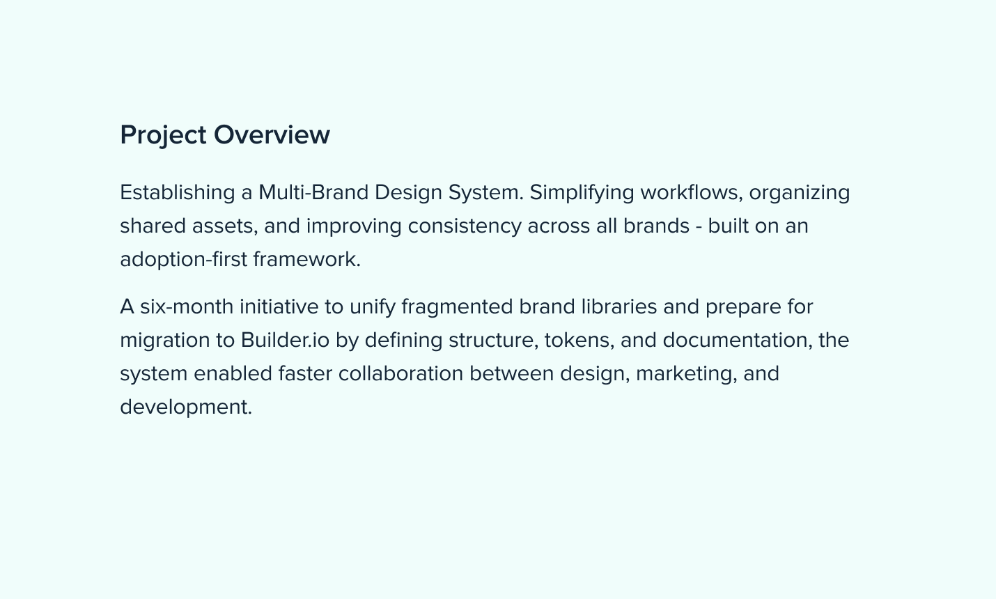
Building consistency across health & wellness brands. Streamlining product management, unifying design patterns, and creating scalable systems.
Challenges and Goals
From Fragmentation to Foundation
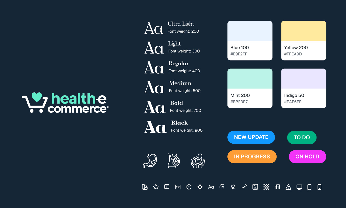
Design files were scattered, naming was inconsistent, and no shared token or component structure existed. The goal was to build a scalable, adoption-ready system that could serve multiple brands and support platform migration.
Key Points
• Scattered brand assets with inconsistent naming
• No unified Figma system or governance
• Missing token architecture
• Low adoption across teams
Design Decisions
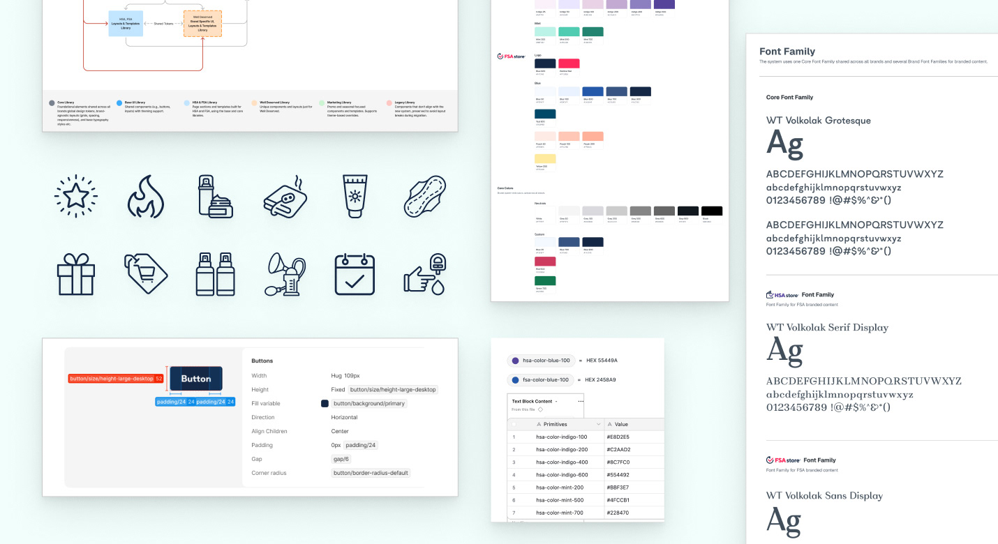
• Build Core → Brand → Marketing libraries
• Introduce token structure for color, type, and spacing
• Simplify workflows and align brands
• Focus on adoption and usability first
Adaption-First Approach
The system was built around an Adoption-First mindset - prioritize clarity and usability over perfection.
The platform transition to Builder.io created a perfect moment to reset and standardize. By focusing on adoption before perfection, I prioritized clear documentation, early team involvement, and practical templates over heavy system architecture.
• Prioritize usable templates, high-impact components, and real-world
documentation over strict system polish.
• Implement reusable Core → Brand → Theme variable structure for
colors, typography, and spacing.
• Created and documented the token system in Airtable
• Ensure every component and token supports brand overrides
(fonts, color, spacing) without breaking structure.
• Published updates weekly to encourage trust and feedback
• Define contribution process, documentation slides, and
update flow via Jira.
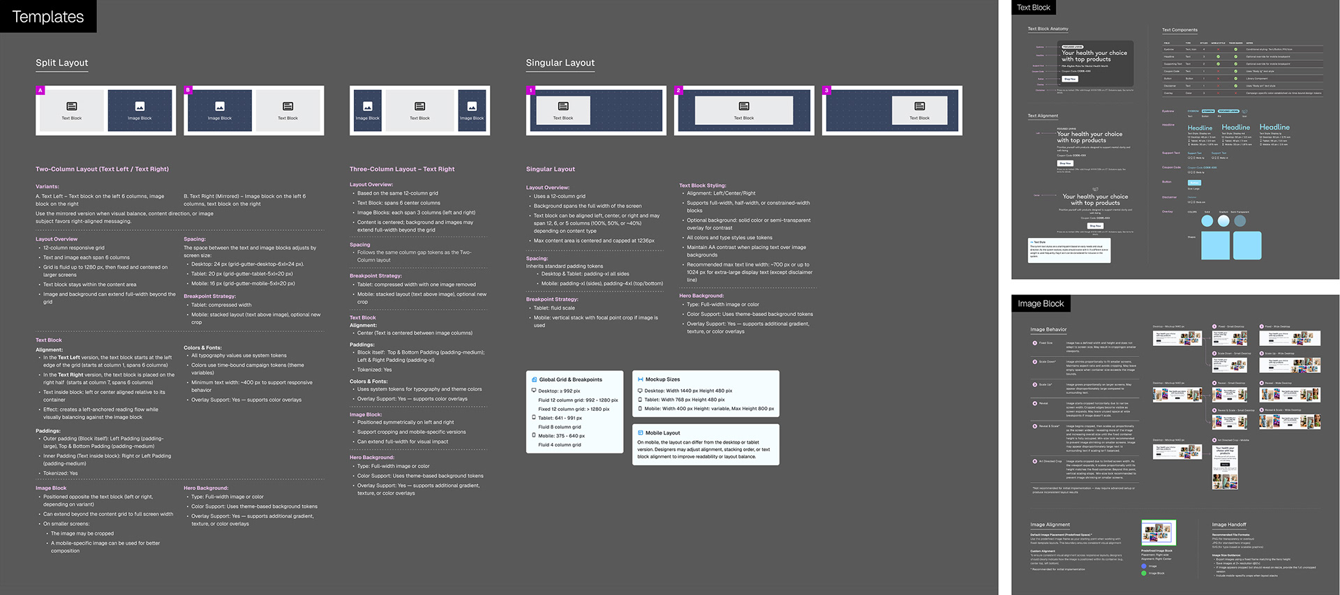
• Created “Hero Cookbook” as the first tangible output -
a ready-to-use hero framework shared across brands
Hero Cookbook
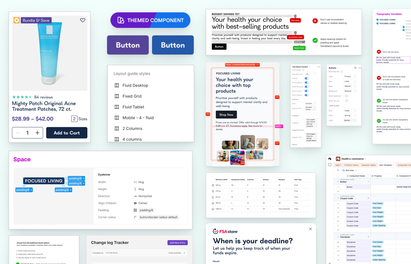
The Hero Cookbook served as the first system application - bridging design and marketing teams.
• 4 layout templates (text left, text right, centered, large text)
• Responsive variations (desktop/tablet/mobile)
• Shared token mapping (colors, typography, spacing)
• Documentation per layout with usage guidance
• Responsive variations (desktop/tablet/mobile)
• Shared token mapping (colors, typography, spacing)
• Documentation per layout with usage guidance
Results and Impact
What started as a fragmented set of brand assets became a system teams could actually rely on. By focusing on adoption first, the work moved beyond structure into something usable, a shared language that made design faster, clearer, and more consistent across brands. The result was not just a cleaner system, but a more confident workflow, one that scaled into Builder.io and set the foundation for everything that followed.
Adoption is the outcome, not the starting point. Systems succeed when teams actually use them.