Redesigning a data-heavy campaign management platform
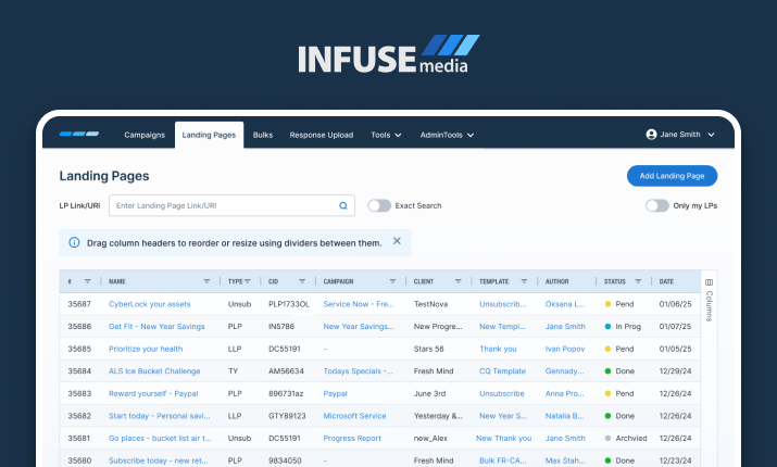
The platform had grown organically over years. The result: tables that stretched endlessly, workflows requiring excessive clicks, and interfaces that made it impossible to distinguish critical information at a glance.
Large tables were difficult to scan, navigation was inconsistent, and repetitive actions required unnecessary effort. Users were not struggling because the system was complex - they were struggling because it wasn’t organized in a way that matched how they actually worked.
Large tables were difficult to scan, navigation was inconsistent, and repetitive actions required unnecessary effort. Users were not struggling because the system was complex - they were struggling because it wasn’t organized in a way that matched how they actually worked.
Core constraint: Users needed better organization, not less information. Any solution had to maintain full data density while dramatically improving navigability and workflow speed.
Understanding power users
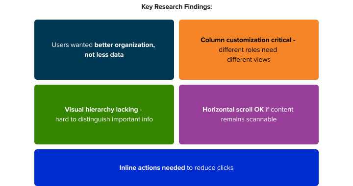
I mapped actual workflows - including the workarounds users had built around the system's limitations. Users tell you what frustrates them; they won't always tell you what they need. So I paired user research with a benchmark analysis of how industry leaders handle the same problems.
The combination revealed two kinds of gaps. Users flagged column customization, too many clicks per task, and eye strain from long sessions. The benchmark revealed what nobody had thought to ask for - missing empty and loading states, inconsistent status treatment.
The combination revealed two kinds of gaps. Users flagged column customization, too many clicks per task, and eye strain from long sessions. The benchmark revealed what nobody had thought to ask for - missing empty and loading states, inconsistent status treatment.
User Interviews
• Current workflow patterns and daily task sequences
• Specific table navigation frustrations and workarounds already in use
• Critical information needed at-a-glance vs. nice-to-have details
• Cross-functional collaboration needs between different roles
Surveys
• Quantitative feature usage frequency - what was actually being used
• Priority ranking of proposed improvements from users themselves
• Task completion time benchmarks: current state vs. desired state
Competitive Analysis
Identify modern table interaction patterns, data density vs. readability trade-offs, and accessibility approaches for information-dense UIs.
Key Design Decisions
Research shaped the direction. These are the moves that turned insights into a working interface.
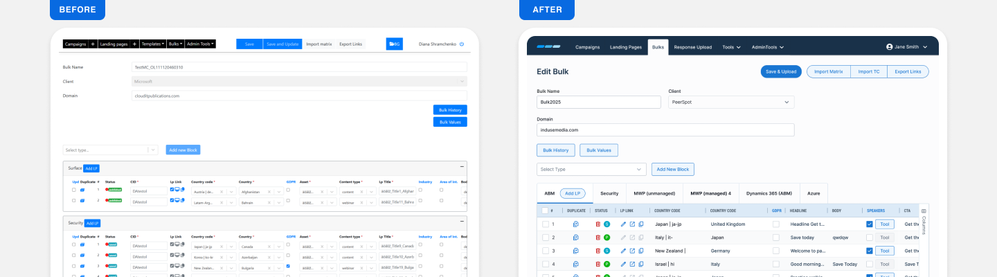
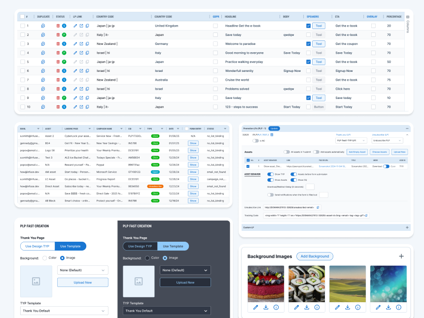
Visual Hierarchy
• Clear typography scale
• Color-coded status badges
• Strategic spacing and color use
Draggable Column Headers
• Users can reorder and resize columns
• Customizable views for different workflows
Inline Action
• Edit, duplicate, delete directly in rows
• Bulk selection toolbar
Better Organization
• Tab-based grouping (Bulk Edit screen)
• Collapsible sections for assets
• Smart filtering and search
Dark Mode
• Complete dark theme
• Accessibility-compliant contrast
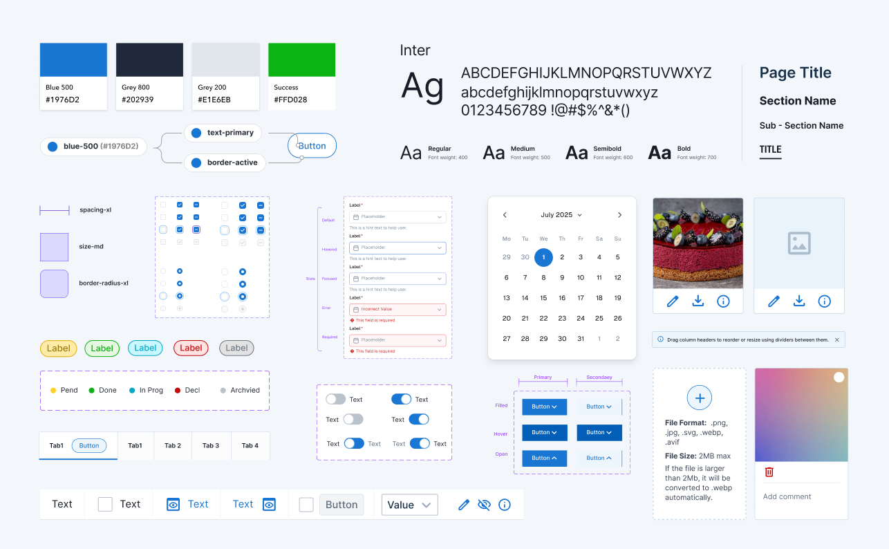
Design System
A scalable foundation — not a one-off deliverable
I built a component library intended to outlast this project - giving the development team a system to build new features without requiring a designer for every element. I defined the token system from the ground up - how colors, spacing, and typography would translate from design to code - then worked directly with developers to make sure it was implemented correctly, not just approximately.
• 100+ components covering data tables, buttons,
forms, status badges, navigation, and modals
forms, status badges, navigation, and modals
• Dark & Light mode
• Full token implementation - semantic and
component-level
component-level
• Token usage documented for developer reference
Impact
Column customization shipped and was adopted immediately. Dark mode hit 40% adoption. Inline actions cut clicks on common tasks. The design system reduced development time for future features. The client started using the redesigned interface in sales demos.
Don't just ask users what's wrong. Ask what leading tools do right.
The best insights came from the combination, not either one alone.
The best insights came from the combination, not either one alone.